Design for Web Content

UK Home Office

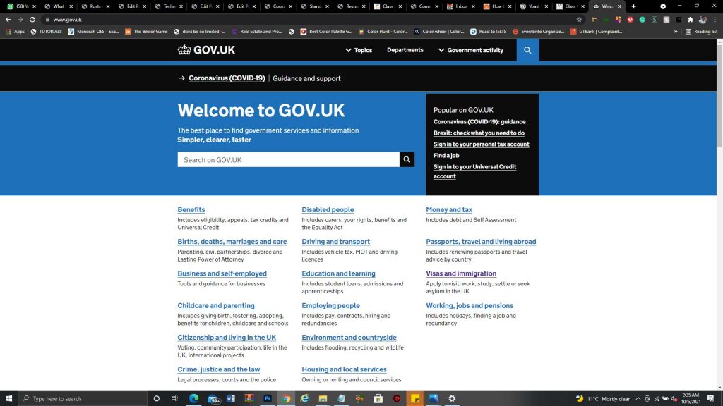
UK Government Website Considering the amount of information contained in the UK government website. I never thought it was going to be this simple and straightfoward. Easy Navigation The navigations on the UK Website is so difficult to miss. Simple Colour Scheme Almost throughout the website, two basic colours were used. Blue for links and …

UK Home Office Read More »

Google

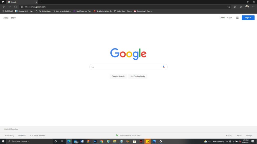
Google Website Believe me when I say, you cannot see a website more simple that google website. Intutive Homepage There is just one thing on the Google homepage “A Search Bar”. This makes it very easy to use Awesome Functionality Each time I use google to search for something online, I usually get exactly what …

Google Read More »

Apple

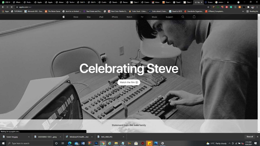
Apple Website Apple’s online store stands out for me because of the following reasons. Soothing Colors The colour scheme used on apple’s website just seems perfect and easy to look at for a long time. Impressive Typography The way Apple’s “SF Pro Display” was used across the website in varying sizes and colours makes the …

Apple Read More »

Bread Toaster

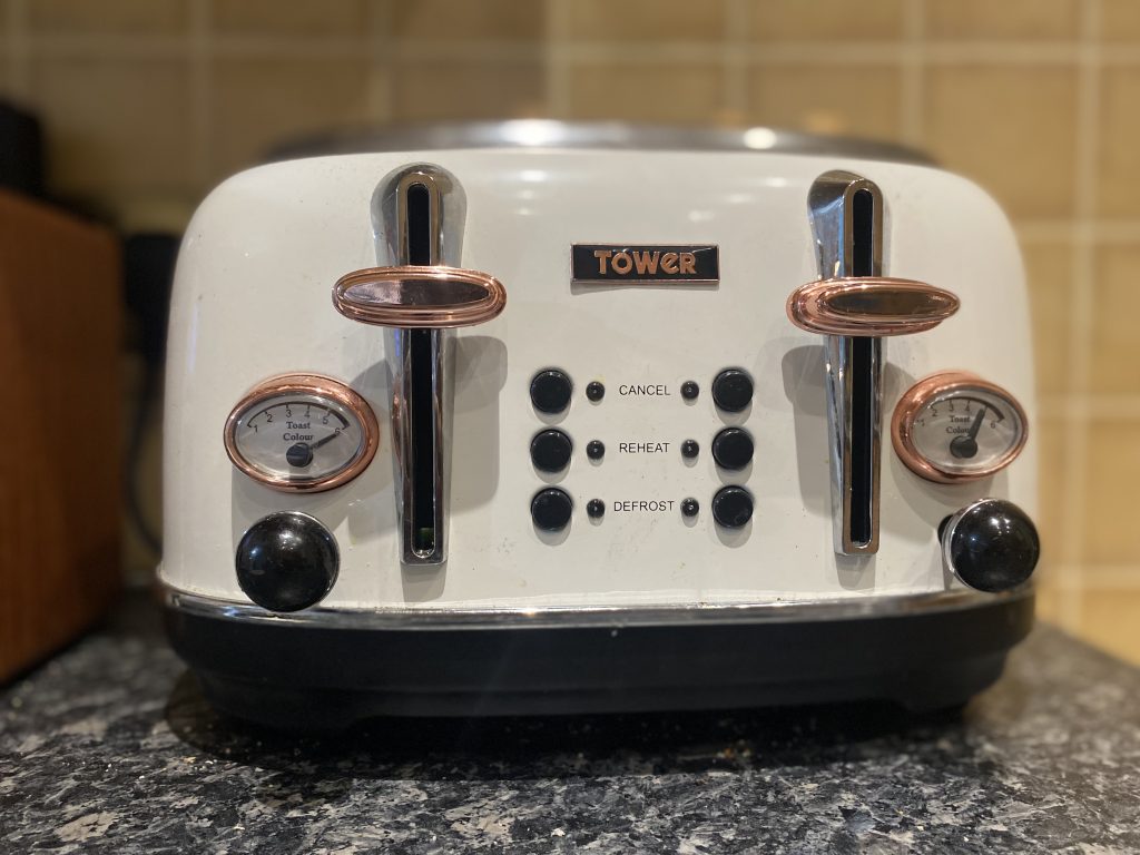
Tower Bread Toaster I recently found out that this Toaster does’t really need a user manual because eveything about it is just intutive. First of all, this toaster has just four openings on top of it which makes it rather too obvious that the bread has to go in there. After that, it’s just natural …

Bread Toaster Read More »