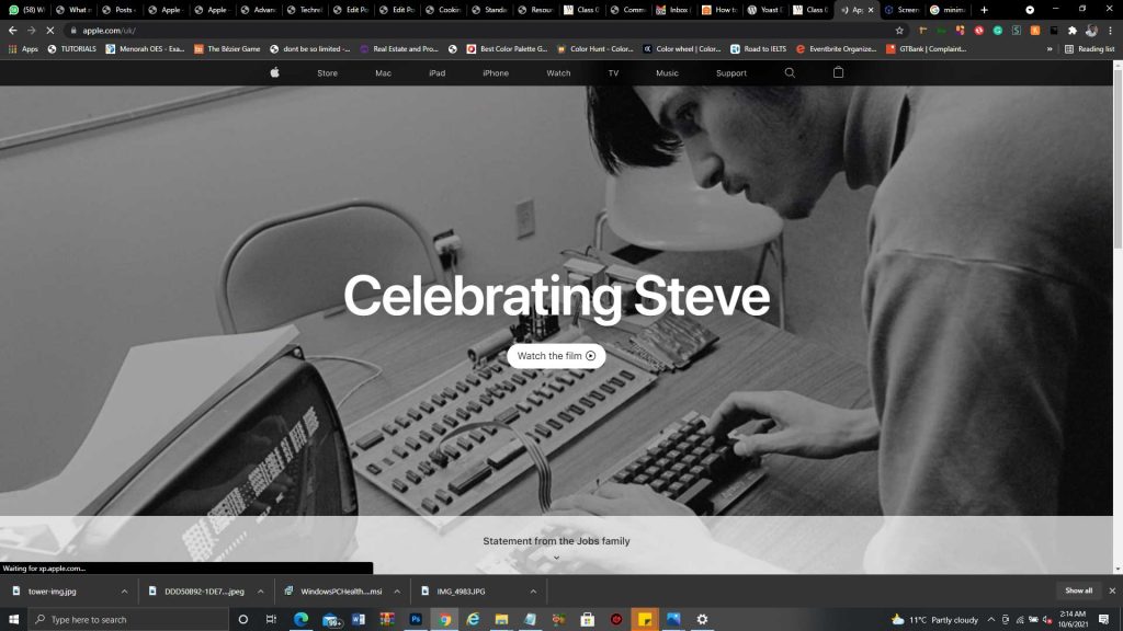
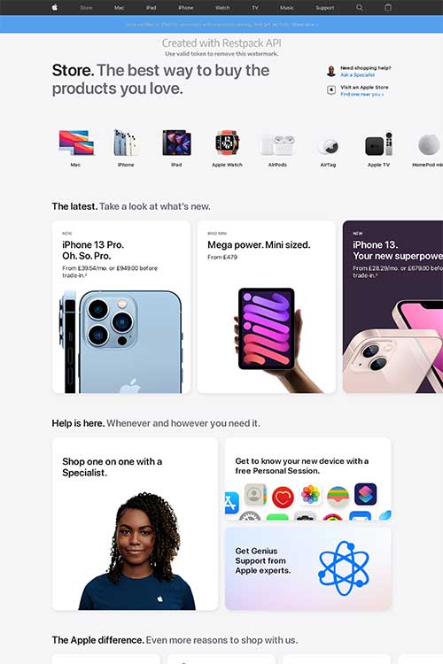
Apple Website
Apple’s online store stands out for me because of the following reasons.
Soothing Colors
The colour scheme used on apple’s website just seems perfect and easy to look at for a long time.
Impressive Typography
The way Apple’s “SF Pro Display” was used across the website in varying sizes and colours makes the website an ultimate eye candy.
Clear Images
The images on apple’s website look so real and clear. The images have proper dimensions and give you a feel of the products.
Minimal Design
The slightly off white background makes the website feel moderate.
Clear CTA
While scrolling through apple’s website, I felt I already know what will happen before I click any of the links therein.
Great Sitemap
The navigation around the website felt so natural. Made it look like it was impossible to get lost in the website.