When you hear “Material Design” what comes to your mind? Something related to interior design fabric and texture. Right? Well, strangely, it has nothing to do with all these. It’s simply a metaphor for Google’s new design specifications.
Inspired by how humans interact with physical objects around them, and their textures, including how objects reflect light, cast shadows, and move. Google is attempting to mimic those types of interaction in the digital world for a more relatable and intuitive UI design process.
Material Design was initially created by Google for Android’s new OS in the summer of 2014. Although the specifications were primarily designed for touch-based mobile app design, it was possible to extend the same ideas into web design.
While online documentation for Material Design as presented by material.io can be overwhelming, I will try to highlight the purpose of material design and how it can help us design better user interfaces.
What is Material Design
Material Design is an adaptable design system developed by Google in 2014, backed by open-source code, that helps teams build high-quality user experiences.
As stated earlier, Google is trying to mimic the real world by compiling rigorous online specs for the material design language. It focuses on making digital components behave like physical objects that reflect light and cast shadows.
As the interior design “fabric” analogy at the beginning of this article, Google’s Material Design considers material to be a homogeneous digital “fabric” created with density-independent pixels (dp) so users can pinch, tap, or swipe and it will respond according to user interaction.
So, interfaces are created out of layered material objects like rectangular bars or circular buttons. Content (text, imagery, video) all laid flat onto the material. Each material is a separate object inside the digital world.
For instance, a webpage with a white background that contains an orange navbar is seen as a material with a full-length piece, coloured white with an orange navbar stacked on top of it using a different material. So, a user interacts with both pieces of material differently as if they are real physical objects.
In essence, Material Design covers all these interactions, motion, depth, fundamentals of light, content hierarchy, and so on. One key point to note is that Material design is a language. It’s not just a UI kit or collection of interface elements, but rather a new way of talking about and looking at interfaces.
Let’s explore the core principles of material design.
Core Principles of Material Design
Material is Metaphor
Material Design is inspired by the physical world and its textures, including how they reflect light and cast shadows. Material surfaces reimagine the mediums of paper and ink.
Material design attempts to marry the real and digital worlds and this helps to improve human-computer interaction. This makes websites and apps easier to use as they now behave like real-life objects.
Bold, Graphic, Intentional
Material Design is guided by print design methods — typography, grids, space, scale, colour, and imagery — to create hierarchy, meaning, and focus that immerse viewers in the experience.
Everything we design should be deliberate and big. Material Design aims to guide designs that make sense straight away and is easy to follow (bold colours, headlines) and create a clear user and uncluttered experience.
Motion Provides Meaning
Motion focuses attention and maintains continuity through subtle feedback and coherent transitions. As elements appear on screen, they transform and reorganize the environment with interactions generating new transformations. Motion is especially useful in providing feedback.
For example, on an android, when you hold down an icon, it pops out a little to tell you that it’s ready to be moved. That small movement is a great way to communicate to the user. That’s what material design aims for.
Material Surfaces
Each material object is measured in dp (Device Independent Pixels). A physical unit that can be converted to inches or millimetres based on the device’s screen size allows designers to create interfaces that are independent of a particular screen resolution.
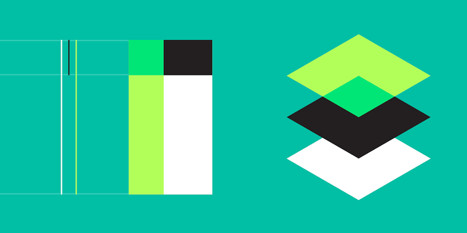
For a digital material to be considered ‘real’, it must lie on a 3-dimensional coordinate system with X, Y, and Z-axis. These serve as height, width and depth of the material and are measured using dps.
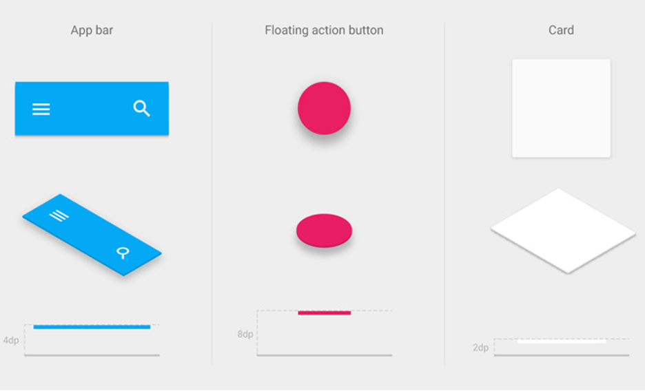
The above diagram (gotten from Google’s spatial objects page in Material Design Specs) illustrates that layering material will create a sense of depth much like in the real world. Content, however, lays flat on the material. Compare this to how ink stays flat on the paper.
Depth is created using light which casts a shadow onto the material lower in the arrangement. So, as an object moves closer to the screen, it casts a dark shadow on the object directly below it. Most design elements are still “flat” but use subtle shadows to distinguish between material depth.
Content Behaviour
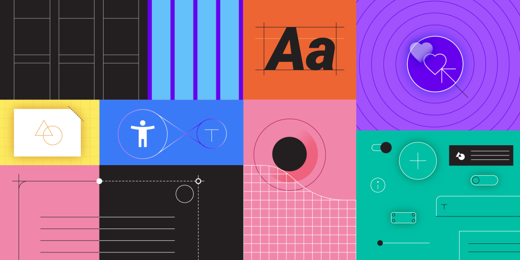
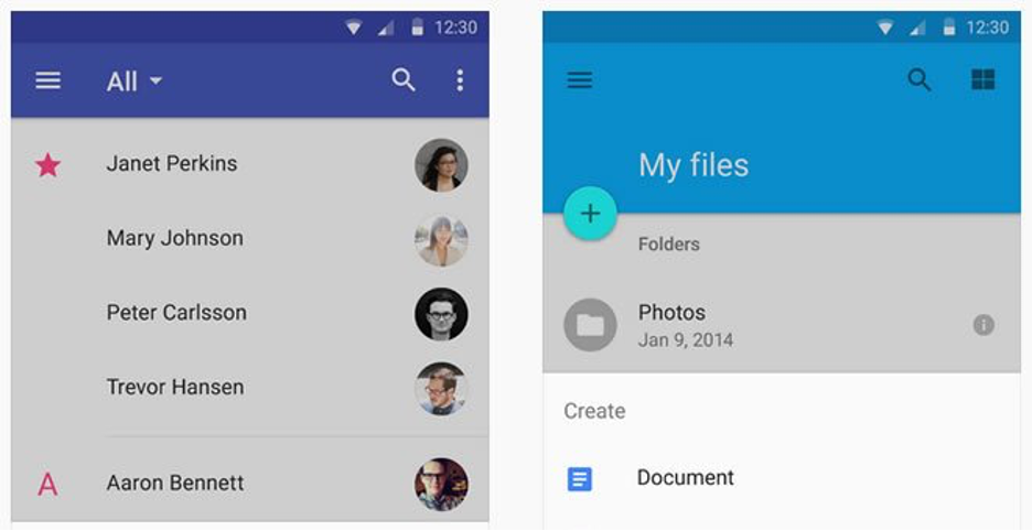
Content is what drives interactivity. When users interact with the content they are also interacting with the material. Tapping a video or selecting text should feel natural. Swiping a button or switch across the screen should faintly mimic the real-world process. Behaviour should feel intuitive based on the user’s goal. It is obvious material design is geared towards mobile interaction, but the same concept could be applied to mouse clicks. Since touchscreen applications are more physical, they require more attention to detail. Look at the Material design components to see a few examples of content merged with interfaces.
Animation & Motion
It is no longer a question of possibility, but a question of necessity to add motion to sliding menus, buttons, modal windows, even icons on our mobile and web projects. It’s considered to be a response mechanism to user interaction which can often mimic reality.
When pressed, some objects compress further than others. When sliding, some objects slides faster than others. It is now possible to create realistic motion for our user interface design project. Google has an entire section dedicated to authentic motion.
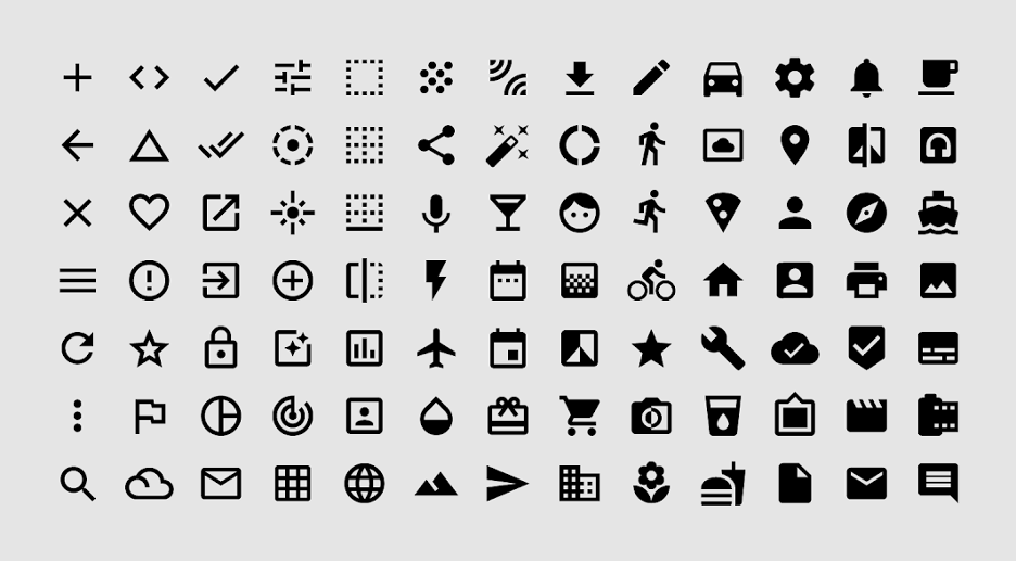
Interface Icons
Another aspect I would like to talk about is the use of icons. When crafting your own interface icons, the biggest thing to remember is consistency.
User interface icons are referred to as system icons in Material language. The goal is to create icons that are instantly recognizable at any size. This typically means very low detail and one solid colour.
Why Material Design is important
- Material Design is important in the context of flat design. It represents the first major shift away from that trend. For the first time, elements have become less flat, and as a result have become easier to use without losing any of the beautiful minimalism of flat design. In so many ways, material design seems like the perfect mix of the old skeuomorphism and flat design language.
- Material Design approaches design on screens from much more physical direction than other design approaches have before. The material design guidelines place all objects on screen within a 3D matrix, rather than 2D. That is, in the material design world, objects (like text box, for example) occupy space. That unique approach makes it both extremely intuitive for users, as well as easy to understand as a designer.
- Material Design can span screen sizes. When it was first announced in 2014, designers were still thinking in three screen sizes – mobile, tablet, and desktop. However, Material Design is designed to be functional across a much wider range of screens, from watches to TV and incorporating features such as screen agnostic motions to inform users.
How can we create better interfaces with Material design?
From design guidelines to developer components presented on material.io, Material can help us build products faster. How?
The material guidelines provide best practices in user interface design. It also provides usability and platform guidance to make sure our app and websites work for all users, regardless of platform.
Within the guidelines, we’ll find the components which are the building blocks that make a product usable and functional. Each component page includes guidance on how they should be used, interaction patterns, and design specifications giving us the information we need to get it right.
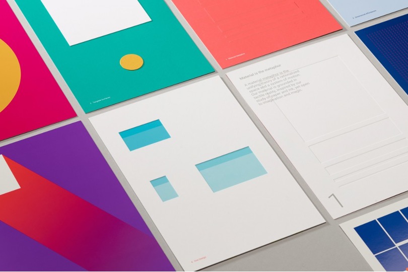
Material also provides the resources and tools that help simplify our workflow. Theme Editor helps us create a branded, simple library to build beautiful UI. We can upload those designs to the gallery to share with our team.
Gallery is a collaboration tool that helps us organize comments and iterations.
Inspect mode provides the developer documentation and links to material components for pixel-perfect UI. We can use material components to start building projects immediately. Open-source code is available for IOS, Android, web, and flutter to help start building ideas in no time.
With guidelines, tools, and open-source components, Material Design helps us build beautiful, usable products faster.
Conclusion
Designed to combat the flaws of its predecessor, flat design, Google’s Material Design offered a new set of building blocks, ones updated for the changing digital world while still retaining elements of the analogue one – depth, shadows, and paper edges for example.
Material Design embraces the fact that we all still live in the off-screen world, and on that note, Google has created detailed guidelines that make it easier for web designers and developers to deliver fantastic user interfaces – all with simplicity and finesse.
However, Material Design should be used as a supportive tool, more like a launching pad rather than relying completely on a Material Design supported framework. It might limit your creativity as a designer when working on projects.