
UK Government Website
Considering the amount of information contained in the UK government website. I never thought it was going to be this simple and straightfoward.
Easy Navigation
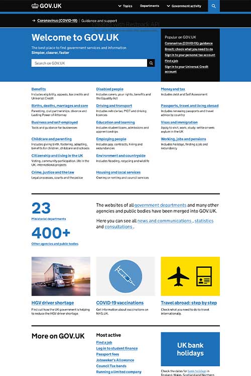
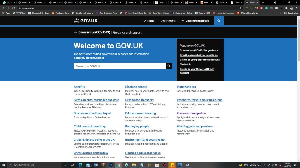
The navigations on the UK Website is so difficult to miss.
Simple Colour Scheme
Almost throughout the website, two basic colours were used. Blue for links and grey for text.
Properly Validated Forms
Most of the forms I came across on the UK Government website made sure I put the correct information required of me.
Secured
Most of the signup forms on this website had 2-factor authentication. This is very important because most of the information given on this website are very sensitive.

